Matkahuolto
Paremmin perillä
Paremmin perillä – the better way. Finland’s favourite parcel service and bus routes & tickets company just celebrated its whopping 90th year in business. It was time for a complete brand and customer experience refresh in order to stay ahead of the curve.
Starting point
Matkahuolto needed our help to create a coherent brand that would combine strategic thinking and an overarching creative concept. But we couldn’t stop there. The company’s business happens through various interactions with customers, whose experience had to work hand in hand with the image we were building – a modern, trustworthy, straightforward partner and operator. With a bit of balls on the side.
Approach
The groundwork started a year before any materials went live. As a joint hasan&co. creative and consulting team, we built the brand and customer experience strategy by conducting numerous interviews, quantitative and qualitative studies, and co-creation workshops with the customer, key stakeholders, B2B & B2C customers and partners.
Once the base was set, including the brand strategy (brand story, personality, tonality, purpose, values... you name it) and the CX metrics (brand image, sustainability, touchpoints along the customer journeys...), we moved on to the brand concept, identity, imagery, audio branding, internal launch, social media... The whole nine yards and more!
Impact
With the fully refreshed, consistent approach to everything they do on a daily basis, which gave them a plethora of tools to work with, Matkahuolto can now focus on what’s really important: bringing people and goods smoothly together.
As they’ve still recently struggled with being solely known as an operator that transports car tyres on buses, the renewed brand strategy has helped them to build on the right kind of brand awareness across the country. Next stop, the world...
Awards
Collaborators
Awards

Brand concept
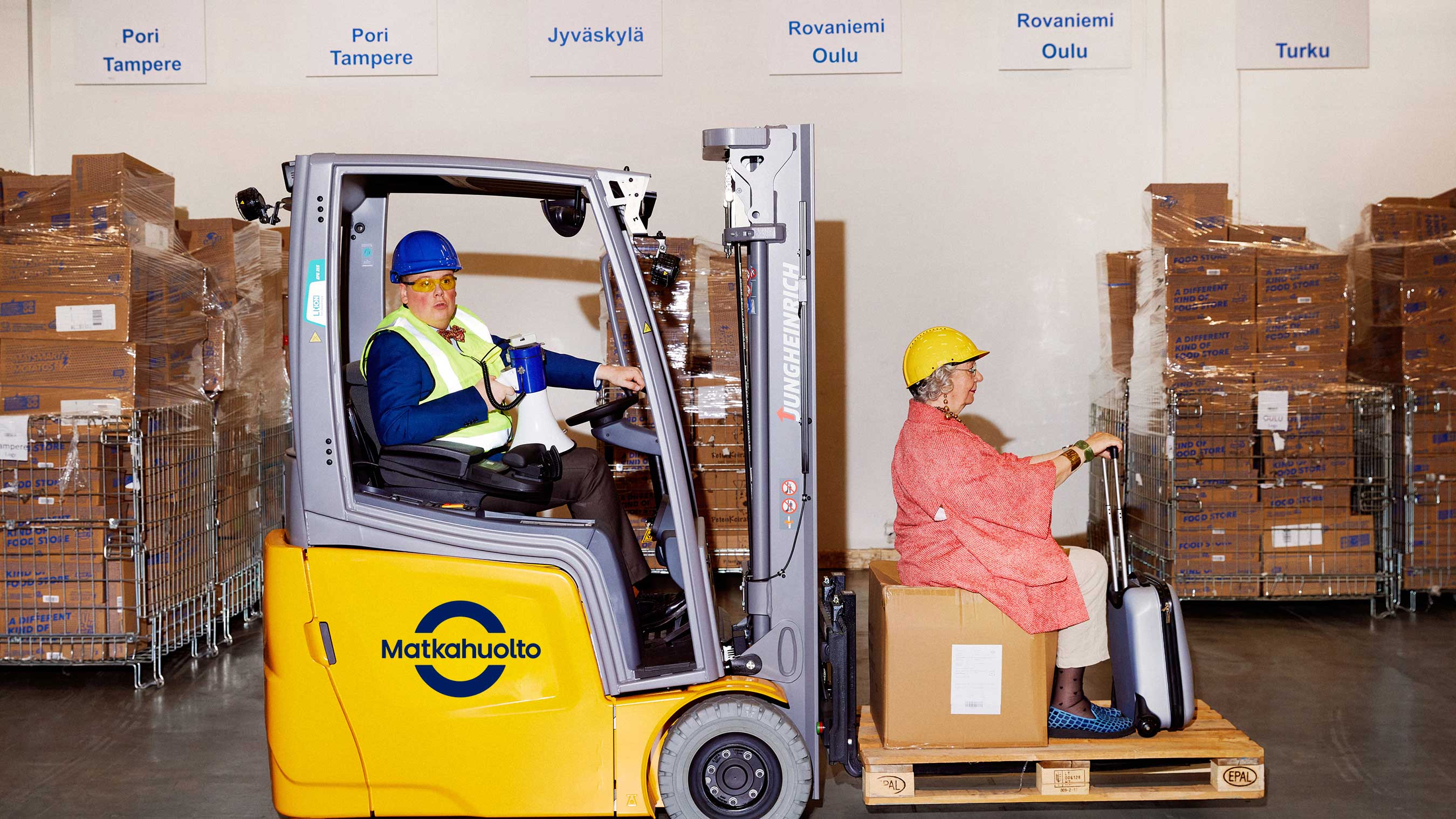
While other operators twiddle their thumbs or create overly emotional Christmas campaigns, Matkahuolto is busy focusing on what really matters: delivering parcels and people from A to Ö. They do it in a way that is honest and straightforward, no BS, if you will. When you choose Matkahuolto, you choose the better way.


Visual identity
Modern, honest, simple, cohesive, playful, eye-catching – some of the words that gave the refreshed identity its direction. We used the colours that were already in the core of Matkahuolto, modernised them and assigned their usage in a clear way to represent both business units. The logo saw a refresh that honours Matkahuolto’s 90-year-strong history, but made the usage simpler and more effective, let alone beautiful. Renewed typography tied everything together, supporting the shapes and form of the overall visual identity.


Brand strategy
Paremmin perillä was a line that Matkahuolto had already used for many years. We didn’t see a reason to change it just for the sake of changing. Once the strategy building blocks were in place, Paremmin perillä felt even stronger and justified to rep the whole company. It talks not only about people and parcels, but the whole experience you get when choosing Matkahuolto as your partner. So instead, our job was to give it meaning, aka meat on the bone, so that everyone at Matkahuolto could proudly stand behind it, and consumers would understand the promise behind it.


“Matkahuolto has brought people and goods smoothly together for 90 years. We now have a strong direction and unique values that truly look and sound like Matkahuolto. Not to mention our refreshed brand that brings the strategy to life in a whole new way – the Matkahuolto way.”


%201.jpg)
